Increased the site traffic through a homepage redesign
Pro Bono Project
My Role
UI/UX Designer, WordPress Designer
My deliverables
User Research, Persona, Competitive Analysis, Sitemap, Wireframe, UI Design, Implemented the Design on WordPress
Duration
4 months
Background
Small Angel Rescue is a nonprofit animal organization located in Frederick, Maryland area. They work with the local animal shelters to rescue, rehome, and rehabilitate hamsters, rats, guinea pigs, gerbils, and mice. Their goal is to be a sustainable, reputable, strategic, and ethical community for small animals.
What is the problem?
Small Angel Rescue saw a lot of first-time pet owners do not know how to take care of their new pets, so they wanted to promote their pet care pageheets on their homepage. Therefore, this project is to educate animal lovers to take care of small animals properly.
What did I think about their design?
- The color and layout of the website looked different from other animal rescue platforms. Unless people read the content carefully, it would be difficult to know if the website saves animals like hamsters, rats, guinea pigs, etc.
- The site navigation was complicated. People might need to look around the site to search for information or not be able to find it because they lack patience.
- People might not donate or provide help to Small Angel Rescue because of the outdated design.
Process
Our communication channel
Since Small Angel Rescue and I are physically located in different states, we didn't meet in person. Instead, we met weekly through Google Meet to discuss progress. In between the meetings, we messaged each other if anything came up.
What do users want & who are they?
Small Angel Rescue did not use any tracking tools to monitor their user behavior, so I suggested them to install Google Analytics(GA). After installing GA, I started collecting and analyzing users' data.
Even though GA can collect data, it can't reflect users' feelings and improvements that they wish to have; therefore, I interviewed the volunteers, and prepared a survey with stakeholders and sent it to the newsletter subscribers. The reason that I reached out to the volunteers and newsletter subscribers of Small Angel Rescue was they had been to the website before, so I could learn about their experiences. When I was able to see a pattern of what people wanted, I gathered and analyzed the responses through affinity mapping and listed out the summary in an infographic. It is a great technique to for stakeholder to digest complex data in an easy-to-understand overview.
.png)
The responses gave me background details of our users, and I created Marissa to represent the user group. She was also the decision-maker to guide me through the design process.
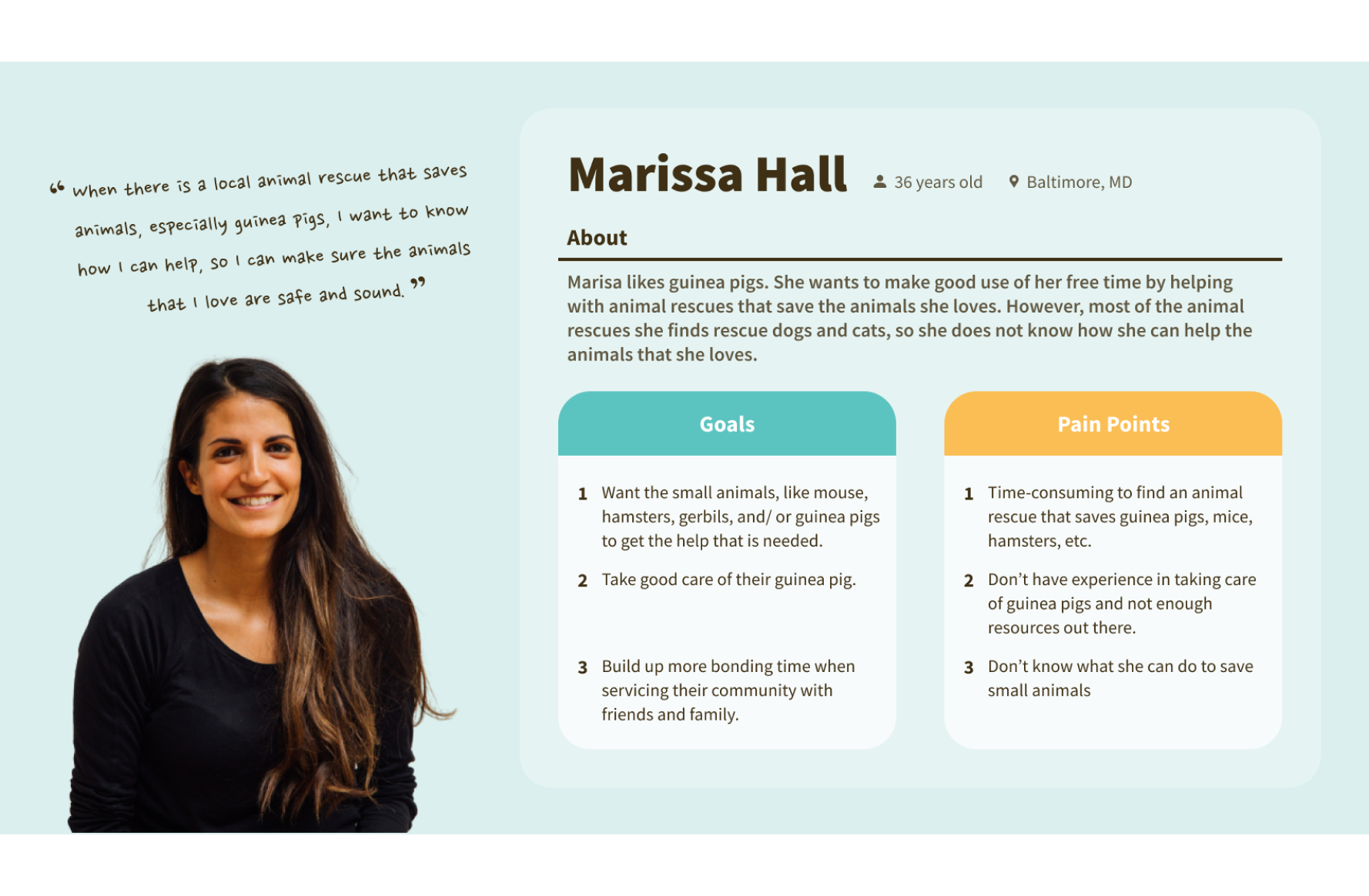
Pain points of using Small Angel Rescue, Inc:
- The site isn't mobile-friendly, but the majority of the users use mobile to navigate the site.
- Users don't want to stay on the site because of the outdated design.
- Users don't want to read when the pages have too many texts.
How to solve the user pain points?
As I was new to the animal rescue platform, I conducted a competitive analysis to grow my basic understanding of an animal rescue platform.
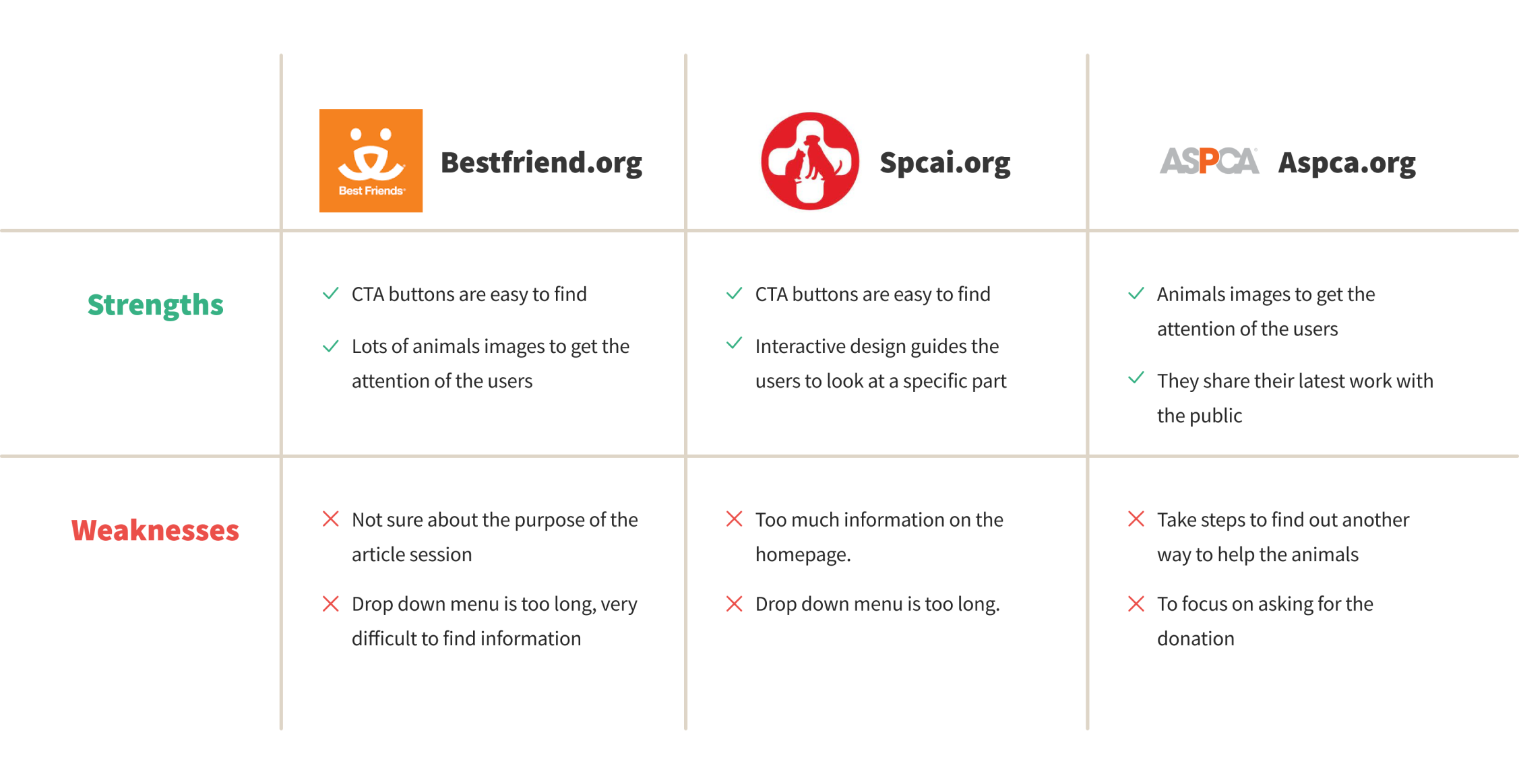
After I had some basic understanding of the animal rescue platform, I was ready to brainstorm different potential solutions to address the user pain points while meeting the project goals, so I created a "How Might We" statement to explore all the possibilities.
"How might we direct users to the web pages that have all the information they need?"
- Restructure and relocate the information.
- Visual improvement: less text, more images to display the information.
- Display the high-demand information in an easy-to-find place.
- Multiple buttons to direct users to the high-demand pages.
- Reserve sections on the homepage to emphasize the high-demand information.
Visualize the possibilities to receive feedback from the stakeholders and other volunteers
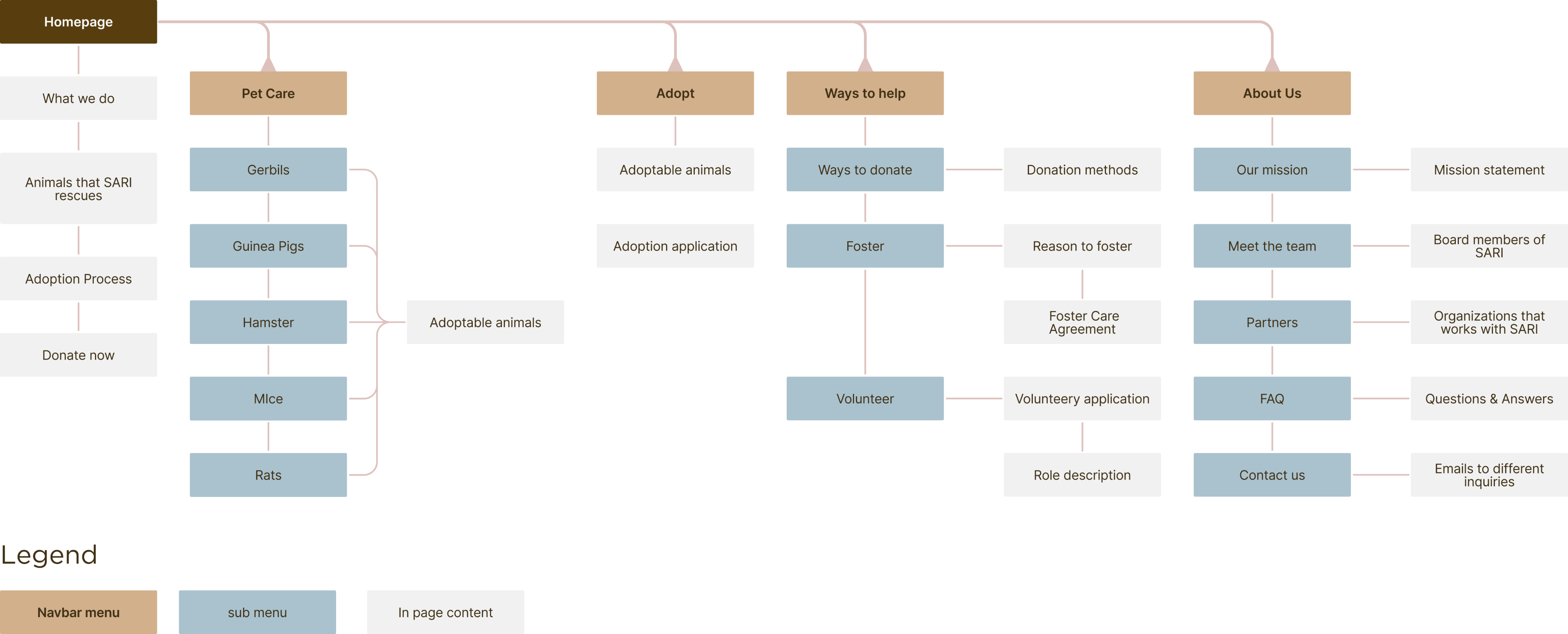
As users wanted to improve the overall navigation throughout the site, I designed a new sitemap with the stakeholders to regroup the information. I also renamed the navbar menu. I wanted users easily predict what information is under each category.
Since the data on GA showed that over 68% of our users use mobile to browse the site, I decided to use a mobile-first approach to create four different designs. The designs could help volunteers to understand the potential solutions and share their feedback with me during the usability testing.
During the usability testing, I wanted to find out if the volunteers of Small Angel Rescue could accomplish the following tasks and which versions do they prefer:
- Can they go to the pet care pages where they can learn the proper way to take care of the animals?
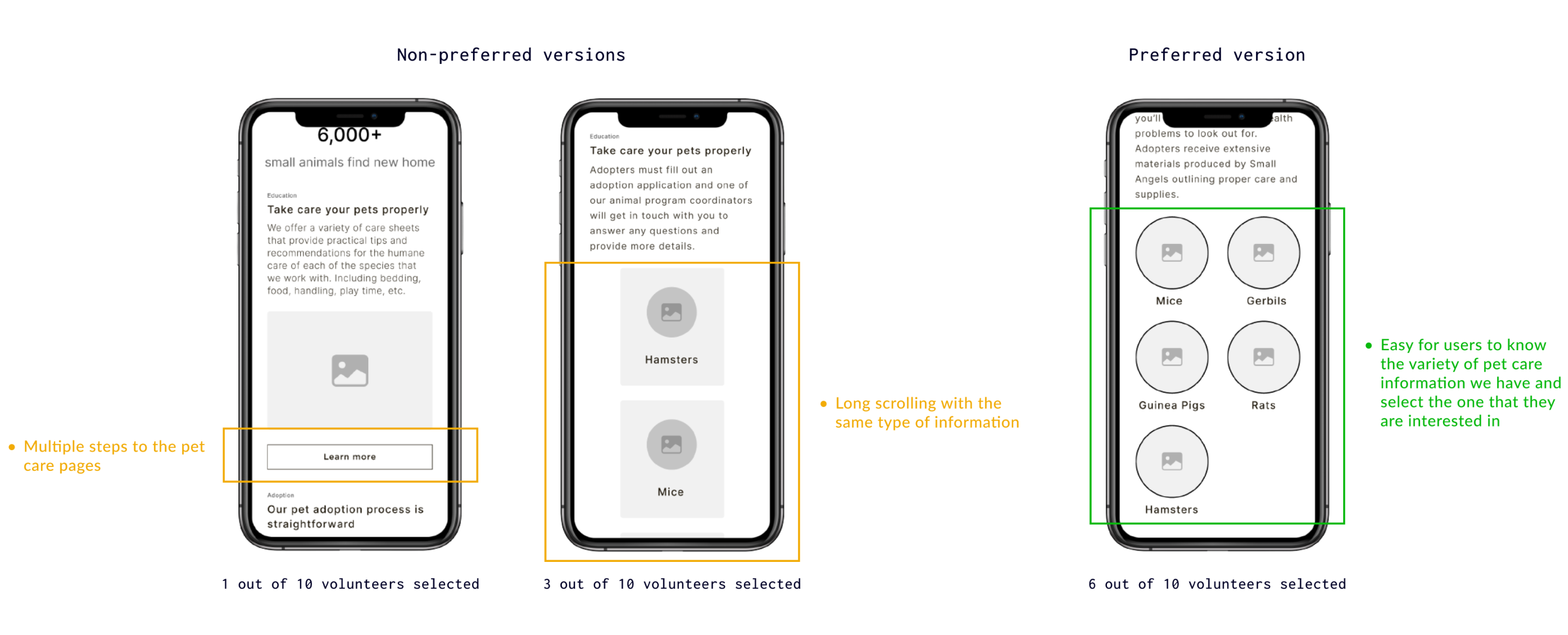
- Can they find out the adoption information?
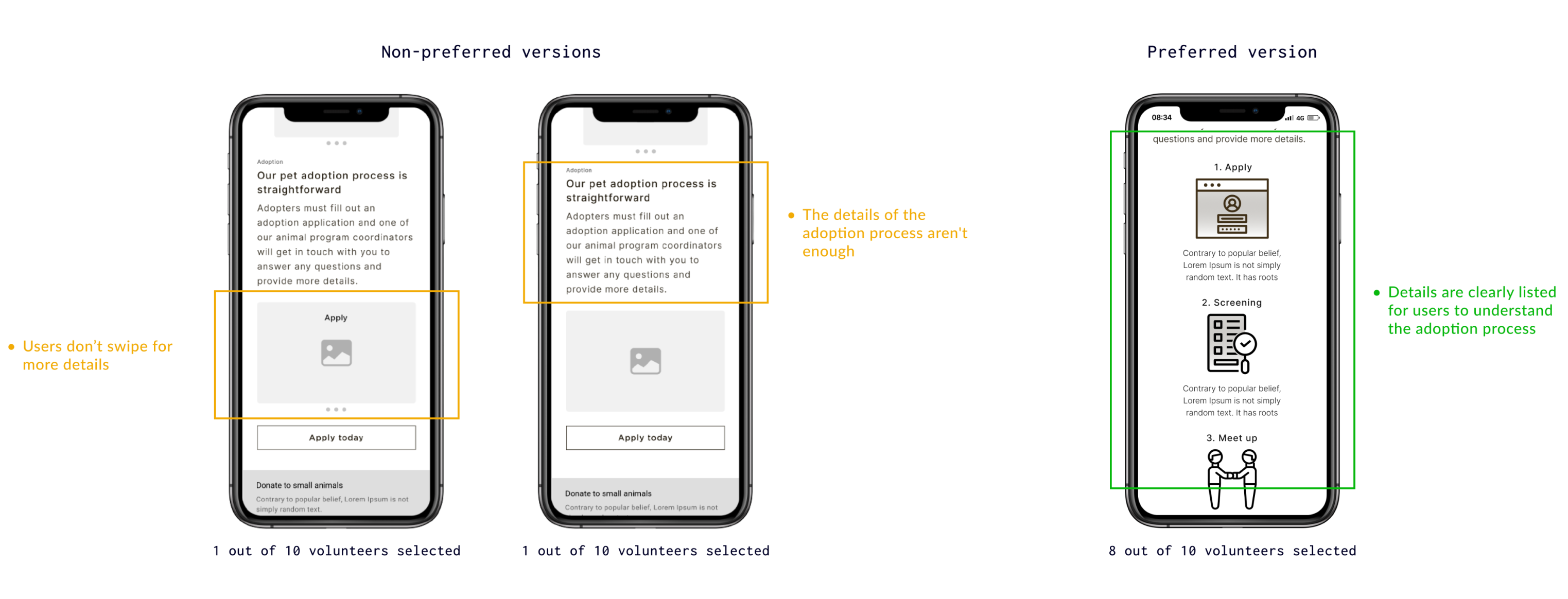
- How did they feel when navigating the landing page?
They felt the layout of the homepage is clean. The images can help them connect with the organization. The popular information is on the homepage, so it is convenient to find, which means the site is easier to use.
How to implement the design on a tool that I have never used?
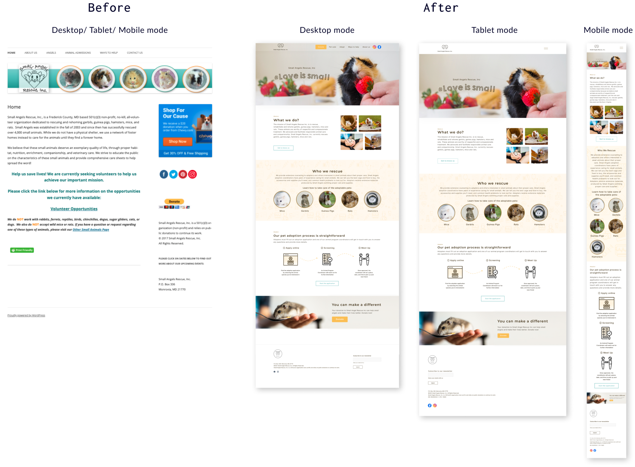
After the usability testing sessions, I consolidate all the feedback and finalized the UI design. The UI aims to stay within the brand style of Small Angel Rescue, so I stuck with their color scheme. From the research, guinea pig is the most popular pet, so I used a guinea pig image as a hero image to attract attention from users.
Since there is always someone managing the site for the stakeholders, they don't know how to use WordPress, so I self-taught myself, like watching tutorials on youtube, joining the online sessions, searching for the online forums. There were some limitations on WordPress, so I used my coding skill to add customized CSS to create the interface that I want to have.
What is the impact of my design?
One month after my design launched, Google Analytics shows the page views of the pet care pages have doubled, and the engagement time is 5% longer, so we can tell users spend more time on the pet care pages to read the content. When they know how to take care of their pets, they can save the animals, so I can meet the project goal while addressing user pain points.
💭 Reflection
- This is the first project I launched my design, and I didn't consider the technical constraint during the design process. The stakeholders and I liked the transparent navbar in the desktop mode, but it was challenging to create that through WordPress, so I had to give that up in tablet and mobile mode.
- It was a great strategy to leverage my previous work experience with online campaigns in this pro bono project. Mixing different research methods makes the research process unique and gives me insight that almost 70% of users use mobile to navigate the website.


.jpg)

