
Increasing engagement rate for a data site

Project Partner
Open Ocean Camera (OOCAM)
My Role
Team Lead, UI/UX Designer
My deliverables
Journey Map, Sitemap, Wireframes, Prototyping, and UI Design
Duration
2 weeks during boot camp
Background
What is Open Ocean Camera (OOCAM)?
OOCAM aims to help marine researchers around the world to sort data cheaply and quickly. OOCAM designed an innovative camera that can stay underwater for the long term to capture marine life at a low cost while collecting tons of marine data.
The current cameras in the market to capture underwater lives are expensive and not efficient. In addition, researchers are tight with budget, and they usually spend long hours to complete their underwater research. OOCAM has an innovative camera and technology to share the workload of marine researchers, so our goal is to design an easy-to-use camera setting and dashboard for OOCAM and marine researchers.
Design Process
Hold on, let me overcome a barrier first!
One of the teammates had a medical condition, so she had been taking breaks and having a hard time picking up where she left in class. I had a meeting with the team to work around the time and resources I had. I wanted to take full advantage of our time to focus on our essential tasks.

OK, we can learn about the products now!
As my team and I didn't have much information about the camera, it would be easier to learn about it when we could use it, so we scheduled a meeting with the founders in their HKU office.During the meeting, they showed us the process of setup the camera with the mobile application, and we had a chance to give them some potential solutions to the problem after asking them a few questions, but not limited to the followings:
- Who are your targeted users and competitors?
- What do users like and dislike the most of your products?
- Describe a situation in which OOCAM is the most useful to your users, and why?
What did we learn?
After the meeting with the founders, we synthesized the information and my teammate, Hazel, created our main persona, Laura. She accurately represents the type of users who uses the products, so we know her needs, goals, and behavior pattern.

How did we uncover Laura's pain points and our solutions?
As we know the details of out targeted users, I went a step further to put myself in Laura's shoes to visualize her process of setup the camera. This step is crucial because it helped me and my team to reveal her pain points and opportunities to address them.

Pain points of using the camera setting and dashboard:
- To use the camera efficiently, it requires a lot of technical knowledge.
- OOCAM does not provide enough instructions to direct users on using the camera setting.
- Researchers still take a long time to translate data on the dashboard.
- Dashboard does not provide graphs or charts to analyze data for researchers.
"How Might We" Statements to solve the pain points:
- HMW create a camera setting that’s easy to navigate?
- HMW translate & visualise the raw data into useful information?

How did we visualize the solutions?
At this point, we have the solutions to address Laura's pain points, so it is time to design a new sitemap. There were many iterations, but we landed on this flow. The site map is not only located where the content is, but it is also a reference for us to divide the rest of the work. Each of us is responsible to work on 2 pages based on our preference, but we also provide assistant to each other to complete the design on time. Therefore, even though I was responsible to work on the community page setting page, I helped my teammate, Cat, to work on the dashboard page.

Using visualizations to conduct usability tests with founders and a marine researcher.
We first had an internal deadline to finish our wireframes, then we presented our part within the team. After that, we made some final changes before we presented the solutions to the founders through a Zoom call.
MVP 1

- Problem 1: Two sections are showing similar data, so we could display other data in one of the sections.
- Problem 2: Instead of showing the uploading progress, it would be more useful for the marine researchers to see some analysis of the fishes.
- Problem 3: We can combine Photo and Video tabs, because the content will be similar.
- Problem 4: Overview page is like a summary page, so we don't need to show the storage details.
MVP 2
After the meeting, we spent a day amending our wireframes before running another usability test with a marine researcher, and below is what he said:

- Problem 1: Fish will be the only species, so do not need a classification.
MVP 3
As there was only one feedback, so we quickly removed the section and start with UI. We spoke with the founders and they were very happy with this version. They thought the background is clean, and it helps marine researchers to focus on the data.
At the same time, I updated the design system, because I wanted to keep our design consistent within the team.

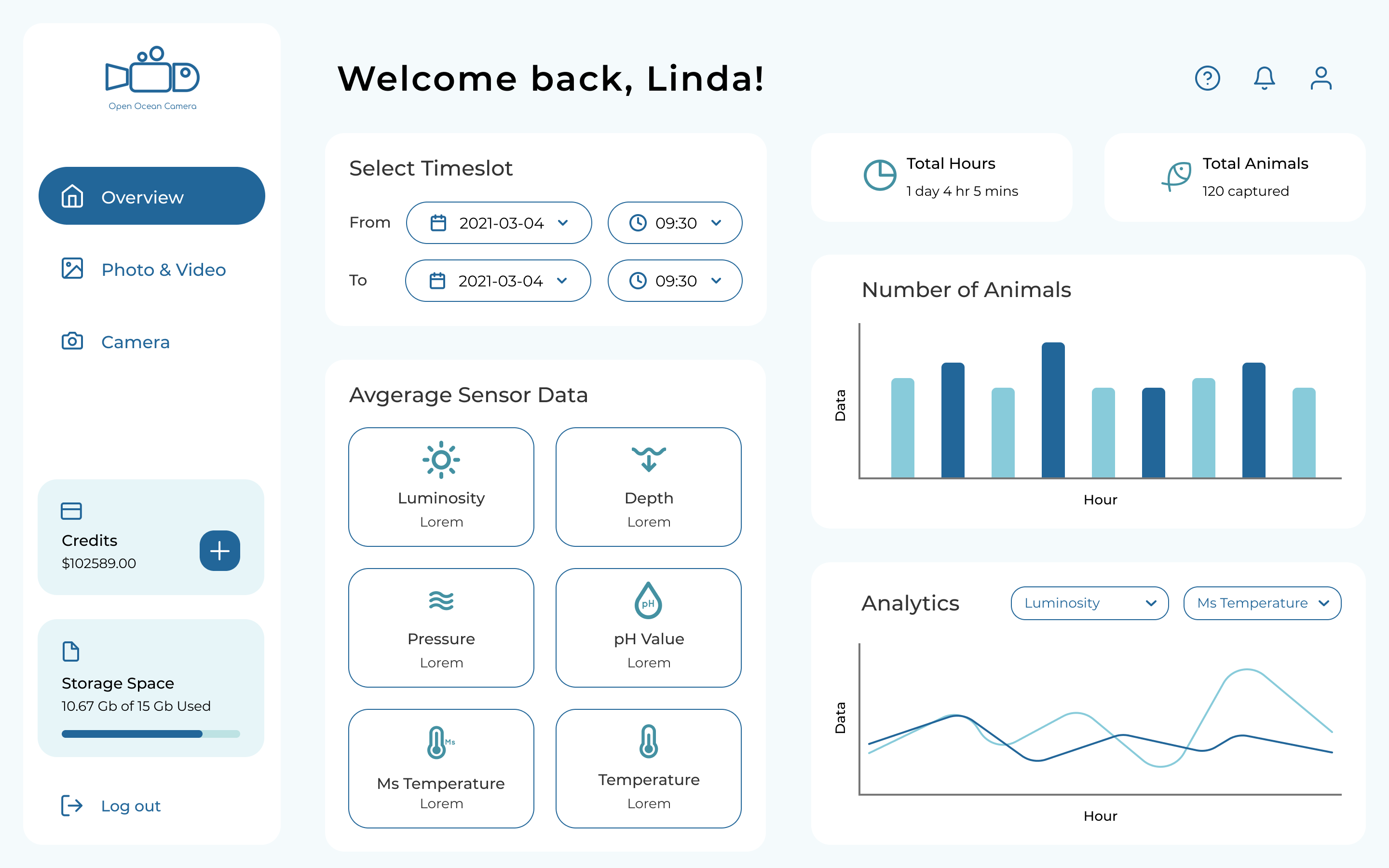
Final Product
Dashboard to view underwater data and camera setting
.jpg)


Takeaway
- The weakness of this project is the lack of user research. To improve that, I would look for more marine researchers on Linkedin and schedule a time to do usability testings. That way, I can validate and confirm our solutions can provide the users' needs.
- The current design is only usable for some of our users because the color contrast ratio of the content is not 4.5:1 against its background, so people with low vision might have difficulties interacting with the dashboard. Therefore, I would improve the color contrast, and everyone can enjoy the same experience when they use the products.